Taking a closer look at the WCAG standards and how they’re measured, we can see that multiple levels or “grades” can be reached. Ideally, your website will reach WCAG’s AAA level, meaning that all text and interactive elements can be easily seen and read by users with low vision or color deficiency. Reaching the AAA level may not always be possible for all elements; if that’s the case for your brand, it’s still recommended that you reach the AA level to maximize the accessibility of your website. Whether you’re speaking to customers, business partners, or investors, your audience will inevitably include people with low vision or color deficiency, and you don’t want to exclude them by ignoring a simple and measurable metric.
Measuring the accessibility of your website
To measure the visual accessibility of your website, there are several different resources that offer tools that align with WCAG standards. Within these, you’ll be able to easily view how various color combinations from your brand’s color palette match up against both the AA and AAA levels. Additionally, these tools can provide a more detailed breakdown between normal text, large text, graphical objects, and user interface components (such as buttons or other navigational elements).
The earlier you can bring these tools into the process of developing a brand color palette, the better. To help measure the visible accessibility of your color palette, consider creating a detailed breakdown of the potential color combinations you want to use for your website.
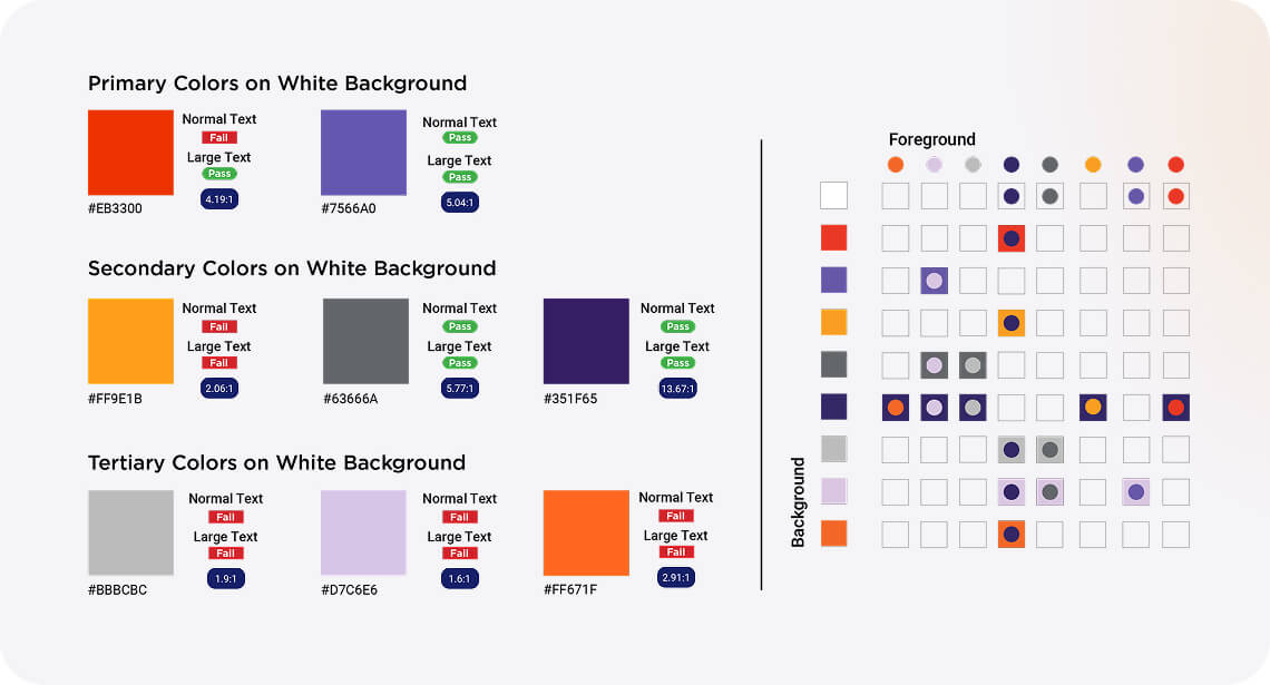
Below, the color compliance chart pulls in Addison Whitney’s color palette and breaks down how various combinations stack up to the standards of accessibility. The left side provides a pass/fail for text sizes against our primary, secondary, and tertiary colors. The right side depicts the contrast between potential foreground and background combinations. Always having a chart like this on hand places accessibility at the forefront of your mind to ensure an ADA-compliant website.